Input modifiers define how end users interact with the configurator. They expose parameters such as numbers, text, selections, uploads, and wizards, which can then drive geometry, logic, materials, or data.
Inputs form the bridge between user interaction and the internal graph logic.
Modifier
Explanation
Input
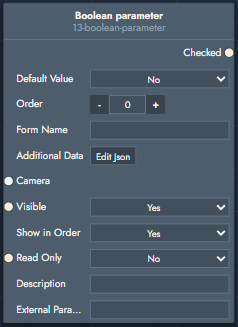
Boolean Parameter
A toggle input that outputs a boolean value (true / false), commonly used to enable or disable features or logic.
Inputs
Default Value: Initial state of the toggle when the product loads.
Order: Order of appearance in the parameter list.
Form Name: Display name shown to the end user.
Additional Data: JSON metadata for front-end usage.
Camera Stand: Optional camera preset linked to this parameter.
Visible: Controls whether the parameter is shown.
Show in Order: Controls whether the parameter is shown in the order summary.
Read Only: Locks the parameter from user interaction.
Description: Short explanatory text shown below the parameter.
External Parameter ID: Identifier used by external front-end code.
Outputs
Checked: Boolean value.
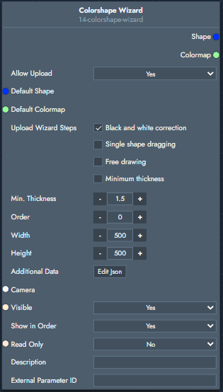
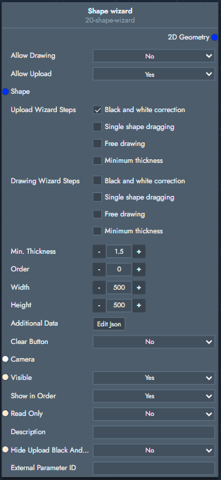
Colorshape Wizard
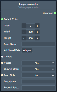
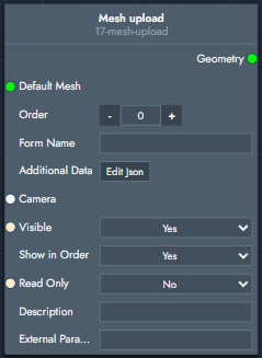
Allows users to upload or draw a shape and an associated colormap, producing both vector geometry and color data.
Inputs
Default Shape: Default 2D shape used before user input.
Default Colormap: Default colormap image.
Allow Upload / Drawing: Enable or disable upload and drawing modes.
Upload Wizard Steps: Black & white correction, single-shape dragging, free drawing, minimum thickness.
Min. Thickness: Minimum allowed line thickness.
Order: Order of appearance in the parameter list.
Width / Height: Size of the drawing/upload area.
Additional Data: JSON metadata.
Camera Stand: Optional camera preset.
Visible / Read Only: UI visibility and interaction settings.
Show in Order: Controls whether the parameter is shown in the order summary.
.svg)